
What are the Indicators of Digital Inclusion?
Use our expert-developed survey indicators to identify barriers to digital inclusion, triage support, and drive digital equality for your audience.
Why adopt the Indicators of Digital Inclusion?
Standardised insights
Expand your analysis to see how digital exclusion is impacting your audience, using the same questions as national leaders to benchmark your data.
Identify hidden barriers
Move beyond "Do you have internet access?" to understand if users lack the skills, the money, confidence and or support to stay connected.
Short and accessible
As well as being short to allow for easier integration to existing surveys, the IDIs are designed in simple language to make it easier to understand and complete for people with low-literacy and whose first language isn’t English.
Three ways to use the Indicators of Digital Inclusion

- Enhance your existing research and surveys: Add these questions to your resident or customer surveys to see how digital barriers impact service uptake.
- Triage support at point of need: Use the IDIs as a diagnostic tool in call centers or community spaces to instantly identify what kind of help a person needs.
- Build your services with digital inclusion in mind: Use the data to decide what combination of support is needed for your audience.
Designed to act as layers, each question builds greater understanding of your audience needs. Use all three together, or if space is short in your survey, just ask question one.
How to turn data into action with the Analytical Framework
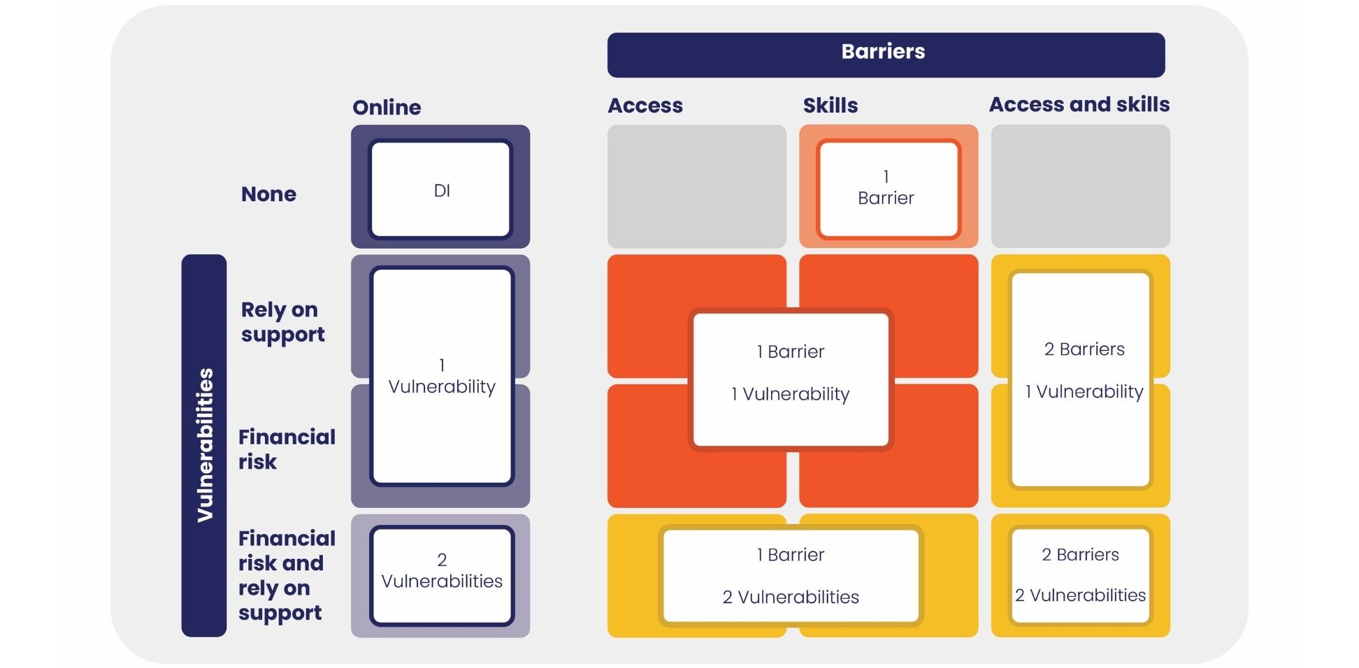
Our framework doesn’t just categorise people, it provides a roadmap for support. By mapping survey responses to the matrix, you can see exactly what will move someone toward becoming digitally included.
Show image description Hide image description
This image is a matrix-style diagram explaining different levels of digital exclusion based on vulnerabilities and barriers.
The matrix is divided into four rows and four columns. The y-axis, labelled "Vulnerabilities," has four categories, each corresponding to a row. From top to bottom:
- None
- Rely on Support
- Financial Risk
- Financial Risk and Rely on Support
The x-axis, labelled “Barriers”, has 4 categories, each corresponding to a column. From left to right:
- Online[i.e. no barriers]
- Access
- Skills
- Access and Skills
Matrix Cells and Categories
Each cell within the grid represents a different level of digital exclusion, combining a specific vulnerability with a specific barrier. The cells are coloured and grouped to highlight eight categories of exclusion into which an individual can fall:
- DI [Digital Inclusion]: the cell in the top left corner corresponds to Vulnerabilities: None; Barriers: Online. This is the lowest level of digital exclusion on the matrix.
- 1 Barrier
- 1 Vulnerability
- 1 Barrier, 1 Vulnerability
- 2 Barriers, 1 Vulnerability
- 2 Vulnerabilities
- 1 Barrier, 2 Vulnerabilities
- 2 Barriers, 2 Vulnerabilities: the cell in the bottom right corner corresponds to Vulnerabilities: Financial Risk and Rely on Support; Barriers: Access and Skills. This is the highest level of digital exclusion on the matrix.
Let’s close the data gap together
Don’t just measure exclusion, help us solve it. When you share your results with us, you contribute to a growing evidence base that influences national policy.
Contribute
Share your survey insights (completely anonymised) to help us map digital barriers across the UK.
Compare
You’ll get access to an updated national benchmark, allowing you to see how your audience’s needs differ from the national trend.
How we built a better way to measure digital exclusion
We collaborated with cross-sector experts to look at how we could accurately estimate the extent of digital inclusion in the UK.
Together, we built the Indicators of Digital Inclusion - a unified measurement tool for digital exclusion.
While large public and private datasets on elements of digital inclusion exist, they often miss the full picture. Our indicators bridge the gap, showing the depth and breadth of digital inclusion and the barriers that impact whether someone can participate fully in a digital society.
Want to find out more?
For more information on the Indicators of Digital Inclusion or the Analytical Framework, please email us at research@goodthingsfoundation.org.
In collaboration with